Top 5 Sites

Alec: I really liked Alec’s site. I like how he wasn’t afraid to put all of his accomplishments out there and almost brag about himself, bu the really made it work. I liked how professional his site looked and I really liked the organization of the overall site. I liked how it was easy to access the different tabs and areas of the website. I also really liked that he did a screen cast of the overall website, which made it so that you could watch him go over the website instead of exploring yourself.

Vailey: I really loved the whole idea of your website. What really drew me in at first was the name, I thought that eat on easton was just a really cute and creative name for the site that let users know exactly what the site was about. I loved at the top how you used actual pictures of Easton ave also. I think that people who have been on Easton ave can really appreciate the small details you put into it. I also thought that the poll was unique to your site and made it stand out. As well as the personal touch of putting a picture of yourself on the about me page.

Bernadette: I really liked the professional approach you chose to take in your website. Right away it felt very professional from the header you chose. I like how although it was professional you added the picture of yourself that was more personal. I think you kept a good balance of being professional and personal. I liked that you chose to do a basic HTML as your video on there. I think that showed your skills and would help an employer to see the skills you have already. I also liked the overall theme of your site.

Samuel L: I really liked how you didn’t use word press , but instead used weebly. I think the overall content of your site was really good. I liked the simplicity of your website but also the added in features. I like how you included an infographic on hte first page. I think those can really help tell a story of a website and help explain to those visiting the site what it is all about. I really liked in your contact section there was a place to fill out your information. I think that this added some personal experience to your website and showed that you are interested in people who want to utilize copy writing.

Kristen: I really liked the idea of your website and all the delicious foods you put on it. I think that food websites can get repetitive sometimes, but I like how yours was all about baked goods. I especially liked how you added what were you own personal favorite recipes. I also like how instead of listing the whole recipe you added a picture of the finished product and then a link to the recipe. Sometimes the whole recipe can take up too much space on a website so it was nice to just see the finished product then be able to click to find the recipe.

Creative Process Midterm

For my midterm, I first thought of something I really loved which is Rutgers University. I love coming to school at such a big university, but then I also thought about how there are so many places I’ve seen but also probably so many places I haven’t gotten to see yet. I wanted to make a site where people could find useful information, but it was also fun to make. I liked being able to add some sites I’ve seen at Rutgers, but also I liked looking up different places that I didn’t know were at Rutgers. I liked making this site because I actually want to end up going to all of these places before I graduate. Also, I think it was a good resource for people coming to Rutgers to visit and also prospective students wanting to come here. I love Rutgers a lot and I like to share with others how great it is. The different campuses have their own vibes and feels to them, and I think that the pictures of the different places made it a really beautiful website. I think that once I started it was pretty easy to get going with the website. I think one of the hardest parts was deciding on what my topic was actually going to be. Since I did a food one for my class blog, I figured I would make the midterm a different subject. I liked doing a different subject and something that I wasn’t really used to but was still passionate about.

Memes

13e0cef23c4323e8d32be0e6322be99a

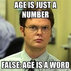
This meme I found to be really funny. I thought it was ironic because Dwight, a character from “The Office” face is displayed right in the middle of it. Dwight is known for being very straight forward and funny in his own way. I think that the words around his face also made it funny because how straight his face is. I think that it is ironic because his face is so straight but the words around his face are actually making a joke. I think it is a sarcastic comment, and the fact that his face is so straight makes it even funnier. I think that memes are meant to be funny, sarcastic, or just read or looked at for enjoyment. I think that it really depends on the person or action being displayed within the meme that makes it what it is. I think that there are a few necessary things that are needed when making a successful meme. I think its important to think about who is going to be looking at the meme. It is also important to see the message it is trying to send. I think that it is also important to look at the picture that is with in the meme. A meme is successful not just because of the words on the picture, but also because of the picture. I think that it also depends on the character and if the words go along with or is something that character said it might make it even funnier. Finally, I think that the most successful memes are the ones that are most current. Ones that make fun of or make light on the current situations going on in the world are the ones that usually get the most recognition or get circled around the Internet the most.

Screencast ePortfolio

I found the screen-sharing to be very easy to use. I downloaded the program and it popped up immediately. I think that programs like this make the internet a more accessible place, especially for people who aren’t as computer savvy. I found this program to be way easier than the Garage Band, which I used for the podcast. I also liked the different links provided of other people’s portfolios because it gave me inspiration for mine. Looking at the other people’s pages I realized that mine could be a little neater, which I am going to try and work on. A huge benefit of screen-casting is that you can easily upload them to YouTube, making them accessible to everyone. Sometimes it is hard to share large files over email, so uploading them to YouTube is a perfect way to share information. Screen-casting also seems like it would be very beneficial in large companies. Global companies who can’t always meet face to face for training or other information sessions could use this software to aid in digital training. At my job my boss uses screen-casting to show the people in the other office how to use new features on our website. It is interesting how different people’s blogs can look by using different programs like Wix, Tumblr, or WordPress. I would love to create a Tumblr for different pictures of pizza because it is more of a picture blog than a wordy one. I found screen-casting to be very easy and functional and I look forward to using this site in the fute.